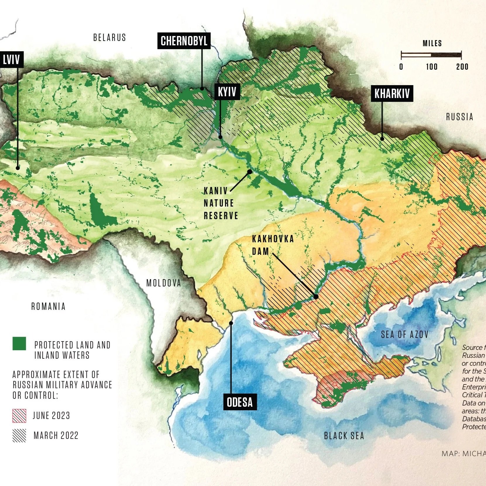
Map depicting Ukraine ecosystems and protected areas, overlayed with data showing the advancing war front in 2023, for Audubon magazine.
Watercolor basemap: Michael Reagan
Art Director: Kristina Deckert
Editor: Jessica Leber
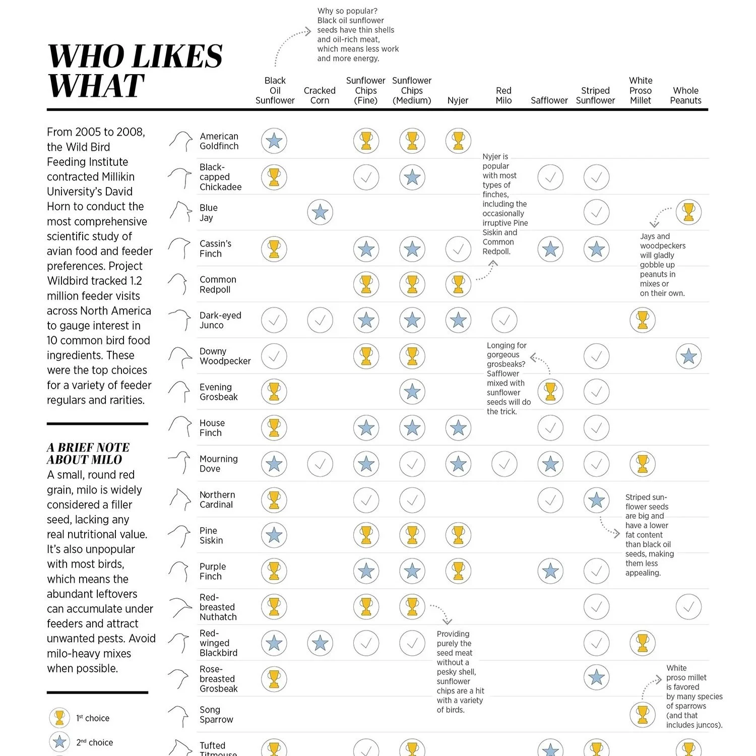
Chart graphic and illustrations for a feature about birdseed in the spring 2023 issue of Audubon magazine. Published in print and online.
This feature was nominated for an Ellie award at the ASME National Magazine Awards in 2023.
Art Director: Kristina Deckert
Editor: Andrew Del-Colle
Map of offshore wind lease and planning areas juxtaposed with Northern Gannet migration, for Audubon magazine.
Collaboration with Melanie Ryan
Art Director: Kristina Deckert
Photo: Lauren Owens Lambert
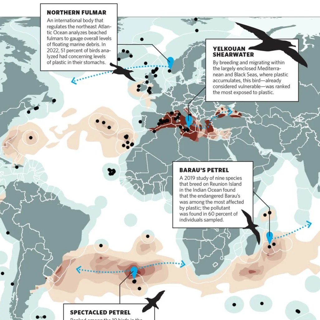
Map depicting seabirds most at risk to plastic exposure in oceans, for the fall 2023 issue of Audubon magazine. Published in print and online.
Art Director: Kristina Deckert
Editor: Jessica Leber
Data: Clark B.l. et al. NAT. Commun. (2023)
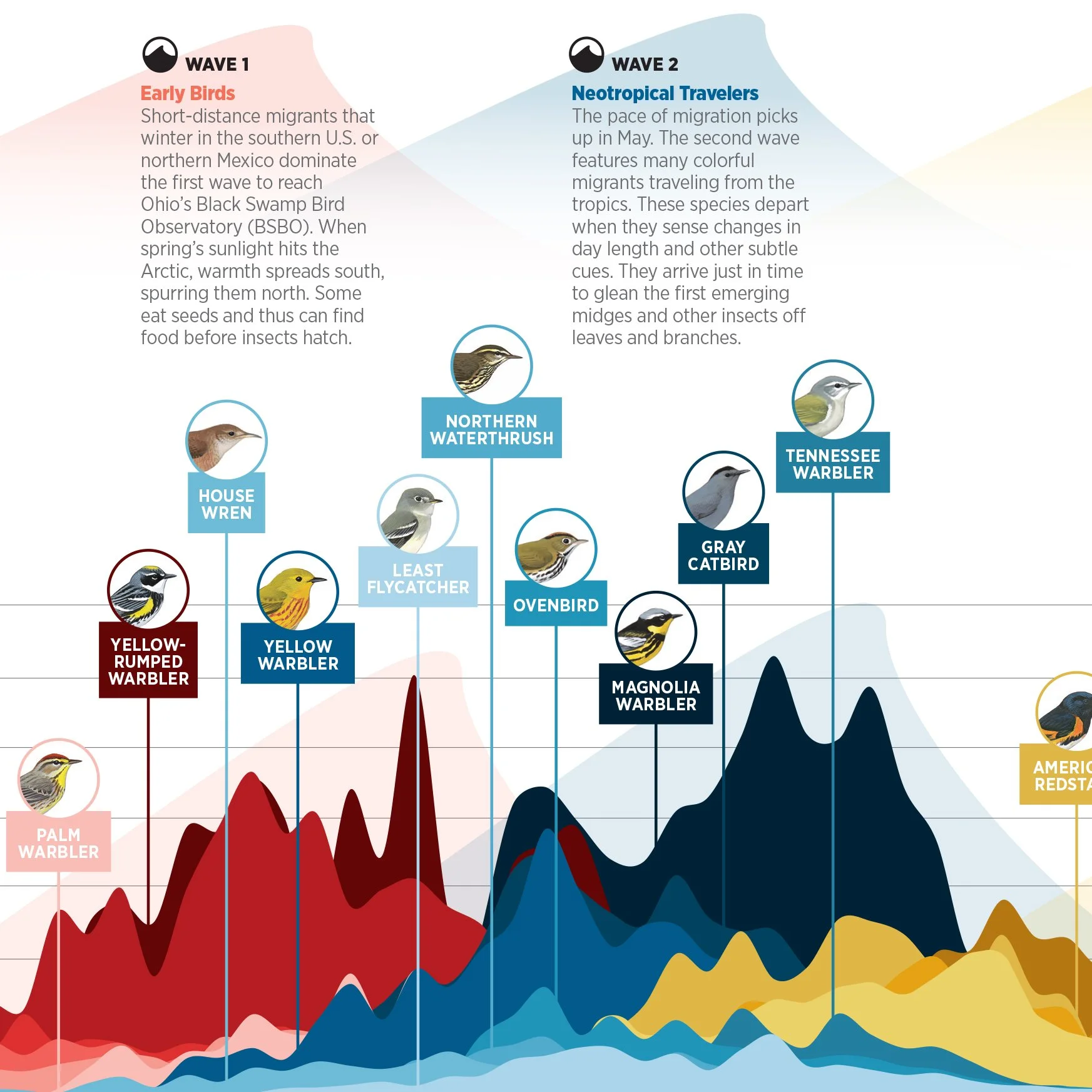
Graphic visualization of the three waves of bird migration that occur on the east coast of the USA, for Audubon Magazine. The gif below shows the interactive version published for web, which can be viewed on audubon.org.
Art Director: Kristina Deckert
Assistant Art Director: Melanie Ryan
Editor: Hannah Waters
Web collaboration: Joel Alcalá
Two infographics created for the National Audubon Society visualizing features of natural infrastructure on coastal landscapes.
Illustrations by Julie Rossman and Alex Tomlinson
Art director: Kristina Deckert
A complete guide to the total solar eclipse of 2017, seen in the contiguous United States.
I produced and designed the full infographic, the headline typography, as well as several small promotional graphics for social media.
Published by World Science Festival and The Week.
The layers of Earth's atmosphere, and what you might find in each of them.
Published by The Week and World Science Festival.
Staff pick on Visual.ly.
A graphic guide to all of Earth's active space missions. As of August, 2015.
Published by Slate, NASA, The Week, International Business Times, and World Science Festival.
Time loops from famous time travel movies, visualized.
Published by Slate, The AV Club, The Week, Science Friday, Konbini, and World Science Festival.
Staff pick on Visual.ly.
A timeline of important moments in computer science history.
An illustrated explainer showing how the first telephone call worked in 1895 and how it compares to present day.
A graphic guide to the nine places in our solar system (outside of Earth) where scientists say life may be possible.
Published by Mental Floss, The Week, and World Science Festival.
We may be in the middle of the sixth major extinction in the history of life on Earth. This infographic examines the five previous "mass extinctions" in order to contextualize the loss of biodiversity that Earth is facing now on a grand scale.
Published by Buzzfeed, Time, The Week, and World Science Festival.
A graph showing the decline in mass of Greenland's ice sheet since 2007.
Several illustrations demonstrating the physics behind roller coasters.
Published by The Week and World Science Festival.